Belmax Floor Company
Belmax Floor Company specializes in wide plank French Oak flooring for custom homes and new construction. Neue Argot Creative created a new logo, website, business cards, shirts and signs to unify Belmax's branding strategy. They requested a modern look that would not look dated in the near future.
![]()
THE LOGO
Phase 1
Belmax came to us with an existing logo that did not represent their business, clientele, nor their quality of work. The strategy was to make a symbol and wordmark that could stand alone, as well as work together. The logo needed to be strong enough to work on multiple platforms and different sizes. Although Belmax is one word, it is a combination of two names, the logomark was broken apart to show both a "B" and an "M" to pay homage to its namesakes. The wordmark has a modern feel while making connections to wood planks in the stylized "E". The decision to use black and white was to avoid trendy colors that would need to be changed every year.
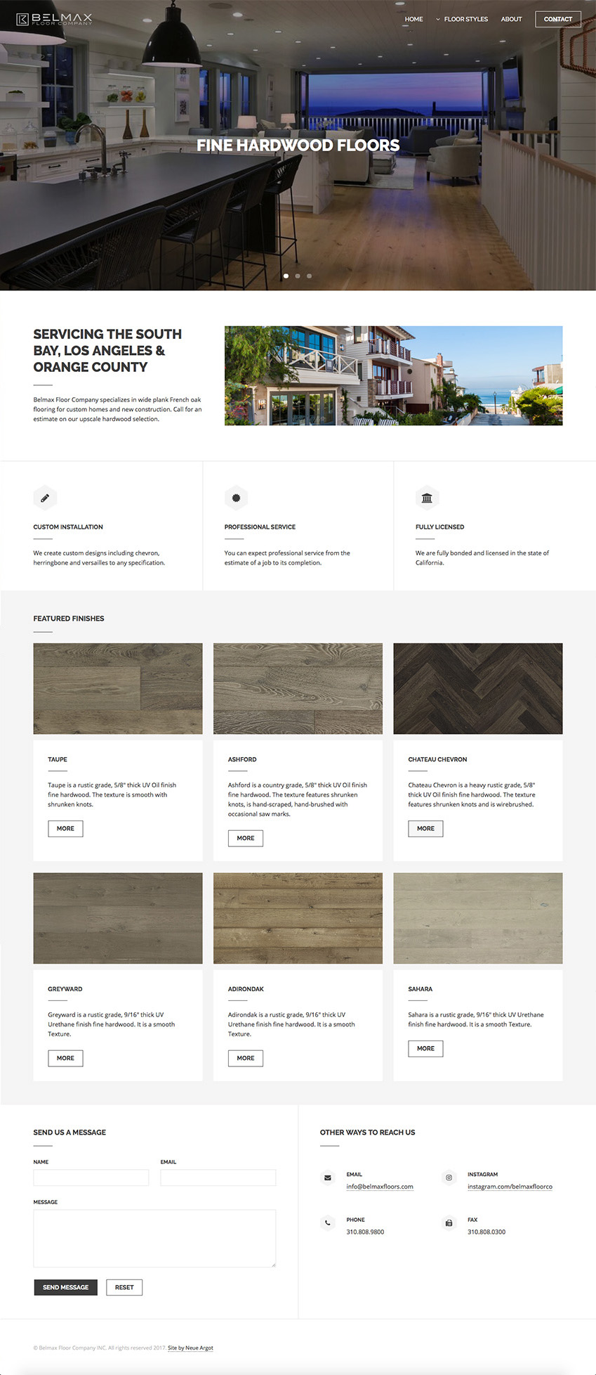
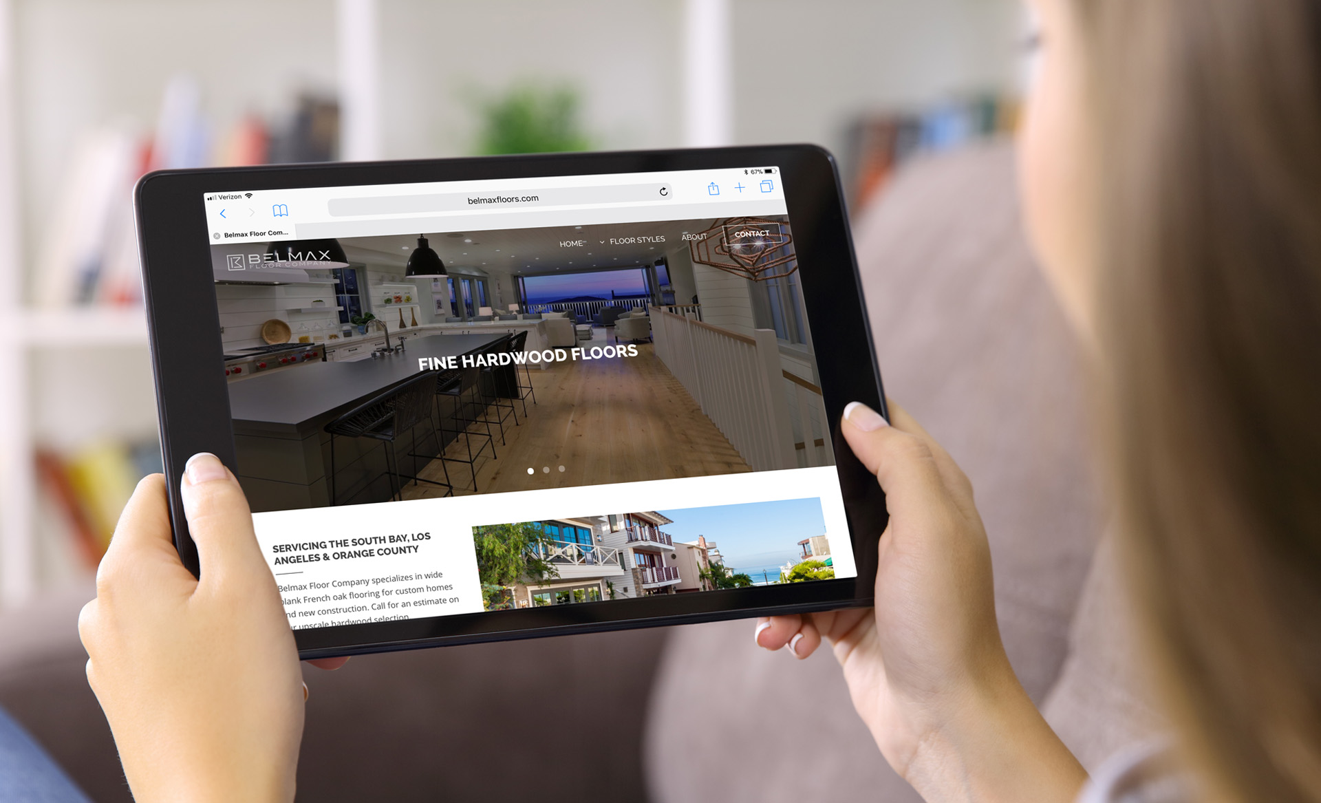
THE WEBSITE
Phase 2
The Belmax website is the first point of contact for a customer who takes to the internet for a search of their business. The site had to convey their high quality of work and their attention to detail. The clean black and white motif was carried from the brand strategy to their website. Clients have an online experience that is simple to navigate and clearly shares Belmax's vision. You can visit the site at belmaxfloors.com
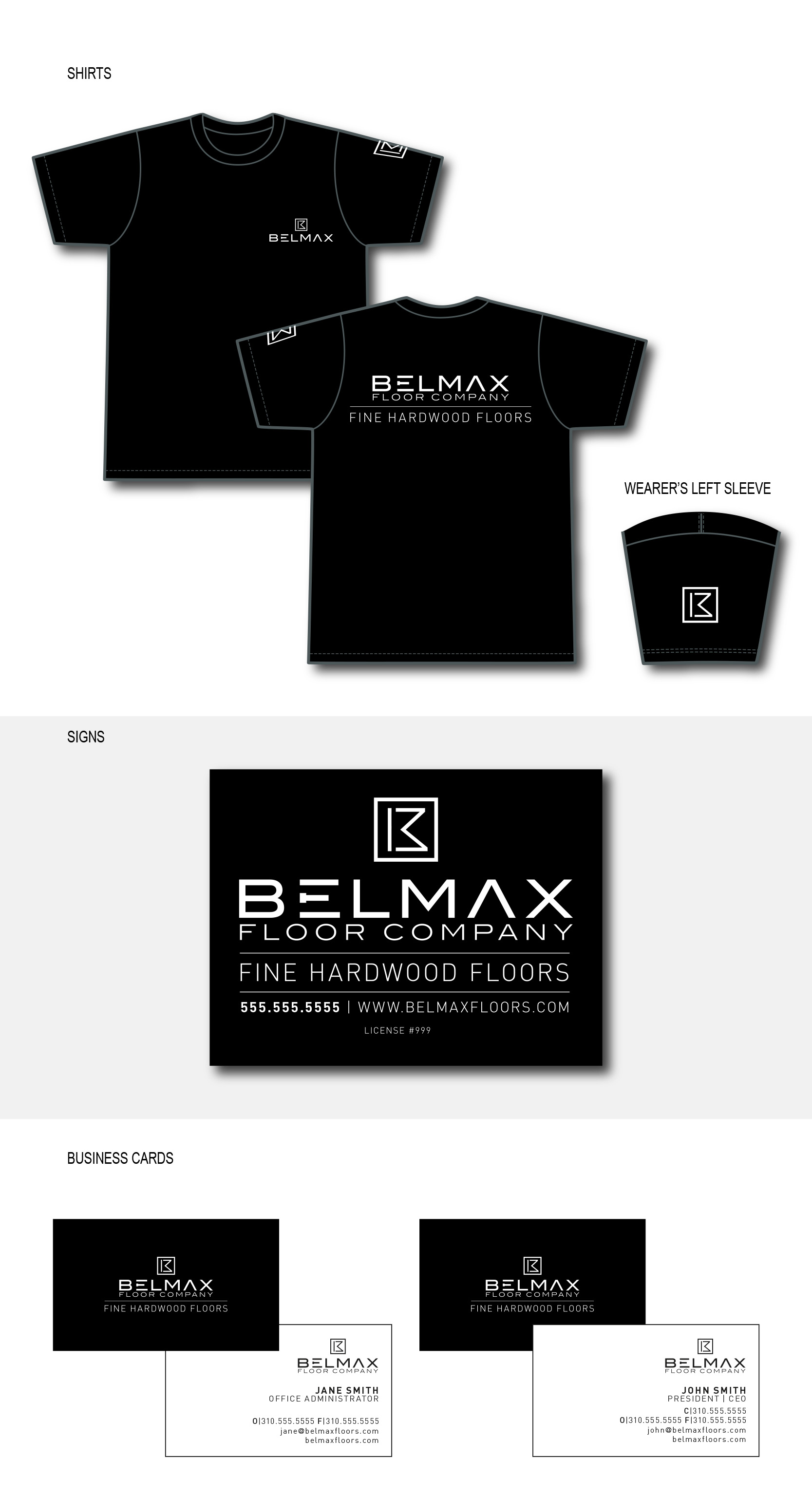
THE BRAND APPLICATIONS
Phase 3
After the logo and website were complete the next phase was designing tangible branding devices. This included shirts for the technicians, signs for the job sites and business cards. It was important to carry the style from the earlier phases to convey a unified brand.